White balance & tone
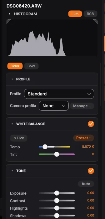
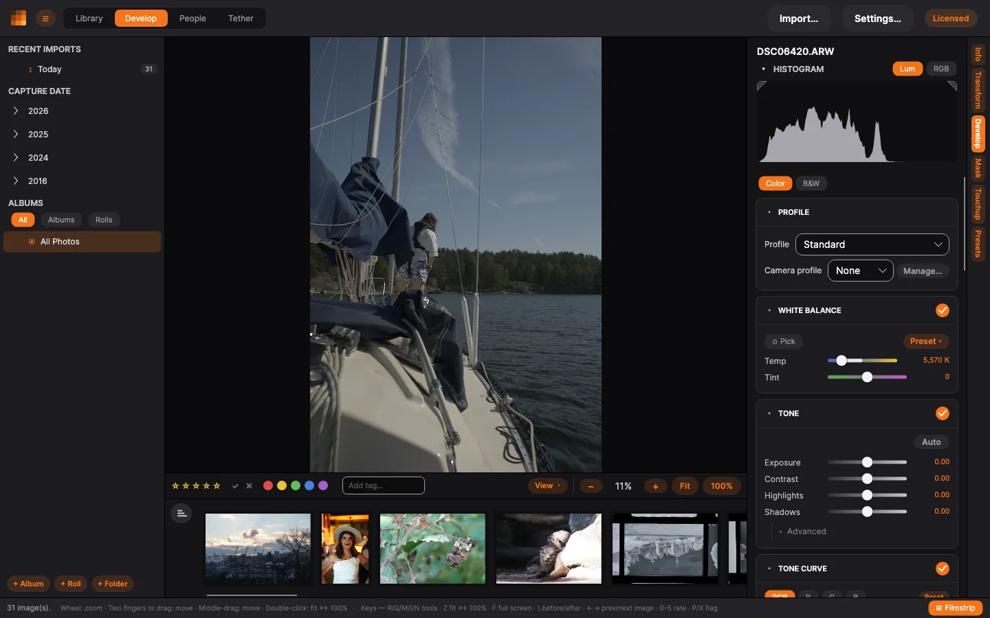
The Develop tab holds PxlMonk’s core adjustments. For most photos, white balance and tone are all you need to get a great result. Open a photo, then click Develop in the right-hand rail.
How the panels work
Section titled “How the panels work”Every group of adjustments — white balance, tone, the tone curve, detail and the rest — is its own card. Each card’s header tells you four things without your having to open it:
- The arrow on the left opens and closes the card. Click anywhere along the header to use it.
- The name of the section.
- The current values on the right: the one or two settings you have changed, in orange. A section you have not touched shows a plain summary instead — Linear, LUT: None, the grain profile — or a dash where there is nothing to summarise. An open card shows nothing here, because the values are right underneath it.
- A switch at the far end turns the whole section off. The picture renders as though that section were not there, and everything in it is kept exactly as you left it — switch it back on and your settings return. Switching a section off is part of your edit: it undoes, it saves with the photo, and it travels in a preset.
A card whose settings you have changed is outlined in orange and carries an orange dot. Open it and a Reset section link appears at the bottom, which puts everything in that card — including anything under Advanced — back to its default in one step.
Some cards have an Advanced block: the settings that belong to the section but that you rarely reach for. It opens and closes on its own, independently of the card around it.
Which cards you leave open is remembered for next time, and it does not change as you move from photo to photo — the panel stays where you put it.
Profile
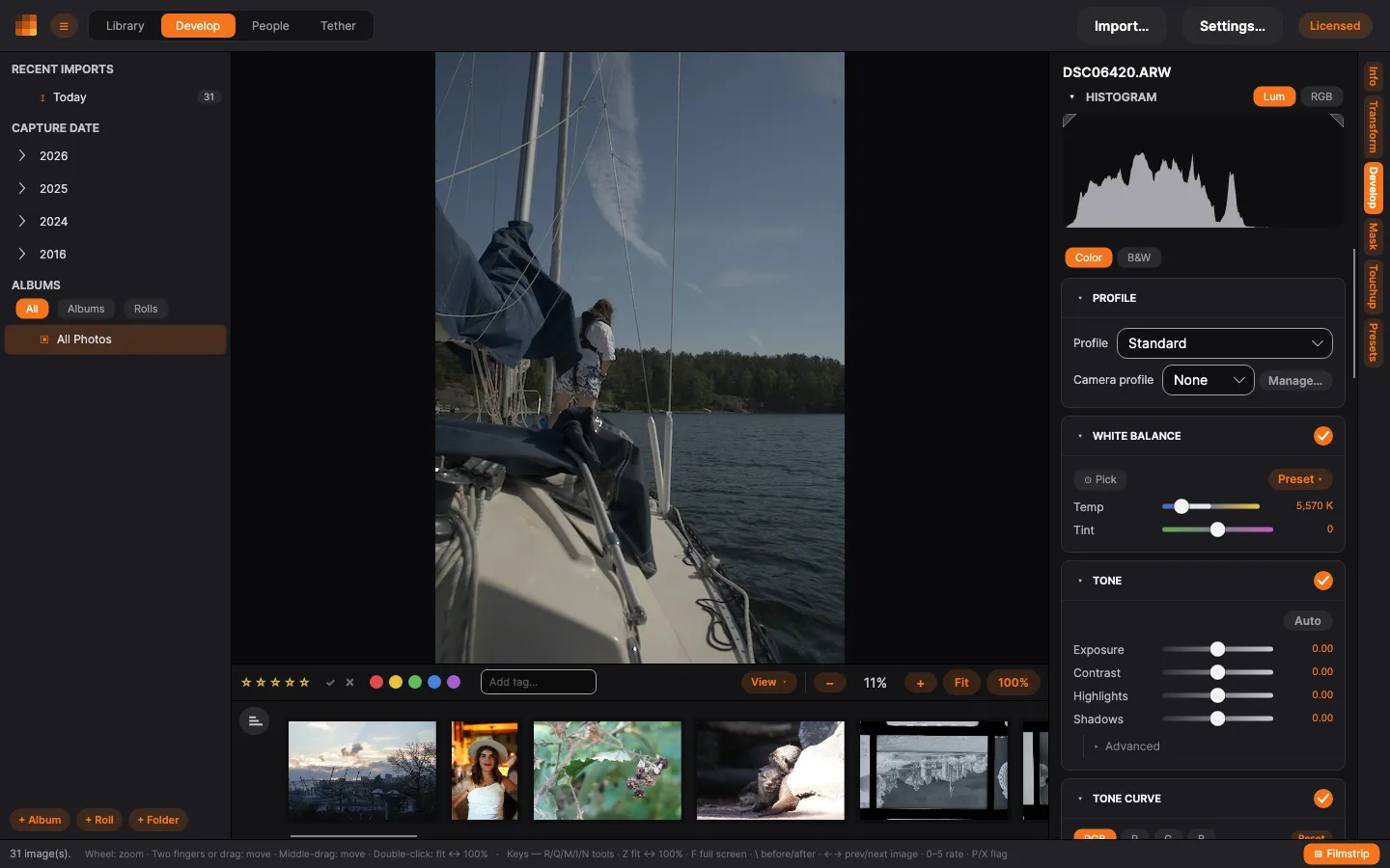
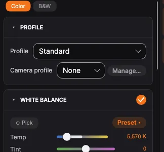
Section titled “Profile”At the top, choose how the RAW is interpreted:
- Standard — a pleasing default rendering.
- Linear — a flat starting point for full manual control.
- Camera profile — apply a DCP camera profile (embedded, or one from your library) to match a camera look.
White balance
Section titled “White balance”Neutralise a colour cast:
- Pick — click a neutral grey area in the photo and PxlMonk sets the white balance from it. Mid-grey is what you want: concrete, asphalt, a grey card. The picker works from the ratio between the red, green and blue it samples, so it needs a spot where all three were really measured. In a blown highlight at least one of them stopped at the sensor’s ceiling and was rebuilt afterwards; in a near-black shadow what is left is mostly noise. Click either and the picker says so under the sliders and leaves the photo as it was, rather than answering anyway.
- Preset — choose As shot, Daylight, Cloudy, Shade, Tungsten and so on.
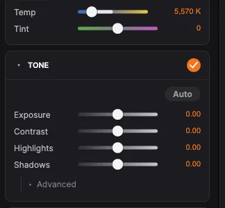
- Temp and Tint — fine-tune manually (warm/cool and green/magenta).
Shape brightness and contrast with the tone sliders:
- Exposure — overall brightness.
- Contrast — global contrast.
- Highlights / Shadows — recover blown highlights, lift dark areas.
- Whites / Blacks — set the white and black points. These two live under Advanced.
A RAW file holds detail past the point a screen calls white — the sunlit side of a building can carry a full stop of real texture up there. Highlights and Whites reach into it: pull them down and that range comes back under white, where you can see it. Two things follow. Pulling Highlights a long way down brings the brightest parts of the whole photo down with it, which is what recovering a highlight means. And where a highlight is genuinely gone — a sky with all three colour channels flat out — it turns grey rather than revealing anything, because there is nothing there to reveal.
Auto sets a balanced starting point you can adjust from. Double-click any slider to reset it. For finer control, use the Tone curve below.
Color grading
Section titled “Color grading”Tint the shadows, midtones and highlights toward three independent colours — the modern successor to split toning, and it works on colour photos as well as black & white.
- Shadows / Midtones / Highlights — one wheel each. Drag the puck to pick a colour: the angle sets the hue, the distance from the centre sets the strength. Double-click a wheel to reset it.
- Balance — shift where the split between shadows and highlights falls.
- Blending — how far the midtone tint spreads into the shadows and highlights.
Leave a wheel at its centre to leave that range untouched — a gentle amount goes a long way.
Where Color grading tints by brightness, the HSL panel works by colour: it splits the photo into eight colour ranges — red, orange, yellow, green, aqua, blue, purple and magenta — and lets you adjust each one on its own. Deepen a sky without touching the skin, lift tired foliage, or pull one loud shirt back into the picture.
Each range has three adjustments, and the buttons at the top of the panel choose which one you are looking at:
- Hue — rotates that range toward its neighbours. Push red toward orange, or the other way toward magenta.
- Saturation — how strong that range’s colour is. All the way down takes it to grey while everything else keeps its colour.
- Luminance — how light or dark that range is. Lowering blue is the classic way to deepen a sky.
- All shows the three sets at once, for when you are working across ranges.
The slider tracks show you what will happen. Each one is generated from the colour range it belongs to: the hue track for red runs from red-shifted-toward-magenta through to red-shifted-toward-orange, the saturation track from grey to full red, the luminance track from dark red to light. So you can see where a slider is heading before you move it.
Colours in between belong to both of their neighbours and change with both — the ranges blend rather than meeting at a hard line, so you will not get a seam across a gradient sky. Greys have no colour to select and stay exactly as they were, whatever you do here — and the faintest colours, an almost-grey concrete or an overcast sky, take hold gradually rather than all at once, so a barely-there tint is deepened instead of being broken up into mottling.
Values run from −100 to +100, the same scale Lightroom uses, so imported presets show the numbers you would expect. Reset clears all eight ranges at once.
Haze removal
Section titled “Haze removal”Dehaze sits at the top of the Detail group.
Distance puts air between you and the subject, and that air both dims the subject and adds its own light — which is why a far ridge goes pale and blue-grey while the foreground stays saturated. Dehaze works out how much haze each part of the picture actually has and corrects by that, so the distance clears while the foreground is left alone. Because haze adds a colour of its own, removing it brings the colour back rather than just raising contrast.
Pull it negative to add haze instead, which is a quick way to push a background back and give a scene depth.
A little haze left in reads as distance, so the slider deliberately does not remove all of it — a landscape stripped completely tends to look flat and pasted together.
Although the slider lives in the Detail group, the correction itself runs near the start of the processing, before brightness, contrast and the tone curve. It has to: it is undoing what the air did to the light, and that only means anything on the photo as the camera recorded it. The practical consequence is a good one — moving Exposure no longer changes how much haze gets removed.
Local contrast
Section titled “Local contrast”Two sliders in the Detail group, above sharpening. Both run from −1 to +1, and both work in either direction.
- Clarity — broad local contrast in the midtones: the modelling that makes a picture feel present rather than flat. Held back in deep shadows and bright highlights, so pushing it does not crush or burn them.
- Structure — fine surface detail: fabric weave, bark, stonework, skin texture. Turn it down to smooth texture without softening edges, which is often kinder to skin than blurring.
They are deliberately separate. Clarity works on shapes several times larger than what Structure touches, so you can add presence without roughening a face, or lift texture without giving the whole picture that over-processed look.
Both stay clear of halos — the bright and dark rims that appear along strong edges, like a horizon or a branch against the sky, when local contrast is pushed. The effect follows edges rather than smearing across them, so moderate settings stay clean on even a high-contrast scene. At the very top of the range the strongest edges can still show a trace of it, so check those if you push a slider all the way.
Sharpening is a different thing again: it works at the scale of individual pixels, where these work at the scale of things in the picture.
Sharpening
Section titled “Sharpening”In the Detail group, between local contrast and noise reduction.
- Sharpen — how much. Two sub-sliders appear underneath once it is above zero.
- Radius — how wide the edges it works on are. Around 1 is right for most photographs; wider suits a soft subject, narrower fine detail.
- Masking — how far the sharpening is held back where there is nothing to sharpen. Sharpening has no idea what it is looking at: it adds back whatever differs from its surroundings, and in a clear sky the only thing that differs is the noise. Turn this up and flat areas are left alone while edges keep everything. It is a dial, not a switch — halfway holds the flat areas back without silencing them.
RAW files already arrive with some sharpening, scaled down at high ISO where sharpening would only amplify noise. This is not a look but a correction: a RAW has to be reconstructed from a sensor that measures one colour per pixel, and that reconstruction is a blur. Every RAW converter compensates for it before showing you anything. The Sharpen slider sits on top of that floor, as Colour noise does on its own, and camera JPEGs get none because the camera already did it.
Sharpening works on brightness alone and leaves the colour where it was, so it crispens an edge without tinting it — no coloured rim along a branch against the sky.
Like noise reduction it works at the scale of single pixels, so zoom to 100% to judge it — at a fit-to-window view there is nothing to see either way.
Noise reduction
Section titled “Noise reduction”Two sliders in the Detail group, below sharpening. They deal with the two halves of sensor noise, which behave differently enough that one control cannot serve both.
- Denoise — the fine speckle in brightness. Go gently: this is the half of the picture that carries the detail, and pushing it is what gives denoised photographs their plastic, waxy look. The slider deliberately stops short of erasing detail even at 1.
- Colour noise — the coarse blotches of wrong colour that dominate a high-ISO frame, the magenta-and-green mottling in the shadows. This one can be pushed much further before anything is visibly lost, because the eye resolves far less colour detail than brightness detail.
If a photo looks noisy, reach for Colour noise first. It usually accounts for most of what you are seeing, and it costs almost nothing to remove.
RAW files already arrive with some colour noise removed, scaled to the ISO they were shot at — a raw frame carries it at every sensitivity, so starting at zero would mean every photo looked worse than it needed to until you found the slider. The two sliders sit on top of that floor: leaving Colour noise at 0 does not mean “none”, it means “the amount this photo needs”. Camera JPEGs get none, because the camera already did it.
Because the floor is not an edit, Reset all edits returns the photo to how it looked when you opened it, rather than to an unprocessed sensor image.
Genuine colour boundaries survive it — red lettering on dark cloth stays red-on-dark rather than bleeding into a muddy edge — because the smoothing stops where the colour itself changes sharply, not merely where the brightness does.
Both are left out of the preview while you drag another slider and are applied when you let go: at that size the difference is not visible anyway, and skipping them keeps the drag smooth. Zoom to 100% to judge them.
Noise reduction works on the photo as the sensor recorded it — before brightness, contrast and colour, and before the lens correction too. That is the only place the amount of noise means anything: correcting a lens reshapes the photo, which smears the noise together and stretches it unevenly, hardest in the corners, so noise reduction applied afterwards would over-smooth the middle of the frame and leave the corners grainy. Two things follow. Moving either of these two sliders takes a moment to appear after you let go, because the whole photo is recomputed rather than just the part on screen; every other slider is faster for the same reason. And the before/after comparison keeps the noise reduction on both sides, as it does the lens correction — it shows you the difference your edits made, not what the photo looked like before it was fit to work on.
AI denoise
Section titled “AI denoise”Below the two sliders, set apart, is AI denoise. It is a different kind of thing: instead of smoothing the picture, it runs a neural network that was trained on what photographs look like, and rebuilds the frame without the noise. On a very noisy shot the difference is not subtle — on an ISO 16000 frame it removed around 97% of the noise where the sliders above, pushed hard, managed 18%, and it left the eyelashes sharper than they were in the untouched original.
The catch is time, and how much of it depends on your machine. On Windows with a graphics card of the last few years, and on any Apple Silicon Mac, a full-size photo is done in well under a minute; on the processor alone the same photo takes several. Either way it is not a slider you drag — it is a job you start:
- Tick AI denoise and press Compute. The job appears in the task area at the bottom, with progress, and you can carry on working or cancel it.
- When it finishes, the photo updates and a Strength slider appears.
The result is kept, so a photo is never denoised twice. Re-open it next week and it is there immediately. Strength then costs nothing: it mixes between your original and the denoised version, and responds as fast as any other slider. At 50% you get half the noise back — it is a mix, not a gentler denoise.
What makes the difference between a minute and several is Settings › General › Use hardware acceleration, which is on to begin with. Underneath it a line tells you what is actually happening on your machine — that it is using your graphics hardware, or that it could not and the processor is doing the work instead. Worth a look if denoising takes far longer than you expected. Switching it off is the thing to try if your machine misbehaves during a denoise: nothing stops working, it only gets slower, and photos you have already denoised stay exactly as they are.
On Linux there is no graphics acceleration for this yet, whatever card is in the machine. The setting is still there but greyed out, and the line underneath says so rather than leaving you guessing — denoising runs on the processor, and a full-size photo takes several minutes.
Exporting always gives you the denoised picture. If a photo has AI denoise switched on but has not been computed — most likely because you moved to another computer, where your edits travel with the photo but the denoised results do not — the export computes it first rather than quietly handing you the noisy version. That export then takes as long as the denoise itself, which is worth knowing before you start a batch of them.
How hard the model works is decided from the photo’s ISO. There is no control for it, on purpose: the camera already recorded how noisy the shot is, and a second “how strong” setting would only be a slower, more confusing version of the Strength slider.
The ordinary Denoise and Colour noise sliders still work on top of it, and the colour-noise floor every RAW arrives with is switched off while AI denoise is on: denoising twice costs detail and gains nothing.
Add film grain. Turn Amount up from zero and the rest of the controls come alive.
- Amount — how strong the grain is. Zero switches it off entirely.
- Grain character — what kind of grain it is, split into two groups. Under Black & White: Fine, Medium and Coarse for plain size, plus Classic Cubic for the irregular, sandy grain of a traditional film and T-Grain for the tighter, more even grain of a modern one. Under Color: Color Fine, Color Medium and Color Coarse, which are softer and more mottled — colour film grains as dye clouds rather than as silver, and each of its three layers does so on its own.
- Size — how large the grain is, like printing the same negative bigger or smaller.
- Roughness (under Advanced) — nudges how much the grain clumps, either side of what the chosen character already does.
The grain pattern is unique to each photo and stays with it: the same edit always renders the same grain, but two photos never get the same one — just as two frames off one roll share an emulsion and not a crystal layout. Applying a preset or copying settings carries the grain’s character across, never its pattern.
Grain is drawn at the photo’s real size, so what you export is what you set. That also means it looks subtler when the photo is displayed small, exactly as a small print does — zoom to 100% to judge it.
Next steps
Section titled “Next steps”- Exporting — save your finished photo.